Disclosure / Affiliate Notice:
As an Amazon Associate I earn from qualifying purchases. Some links in this article may be affiliate links that earn me a commission at no extra cost to you.
You’ve probably noticed it without really thinking about it: that stunning dress you bookmarked on your laptop somehow looks different when you pull it up on your phone later. The colors seem more saturated, the fit appears altered, and details you swore you saw clearly are now harder to make out. This isn’t your imagination—it’s the reality of how fashion photography translates across different screen technologies and sizes.
The shift from desktop to mobile browsing has fundamentally changed how we perceive fashion items online, creating a visual gap that affects everything from color accuracy to our ability to judge fabric texture and garment proportions.
The Screen Size Reality Check
Fashion photography was originally optimized for larger screens, where photographers and retailers could showcase intricate details like fabric weaves, button quality, and stitching patterns. On a 24-inch desktop monitor, you can zoom into a blazer’s lapel and actually see the thread count. That same image on a 6-inch phone screen compresses all those details into a space roughly the size of a postage stamp.
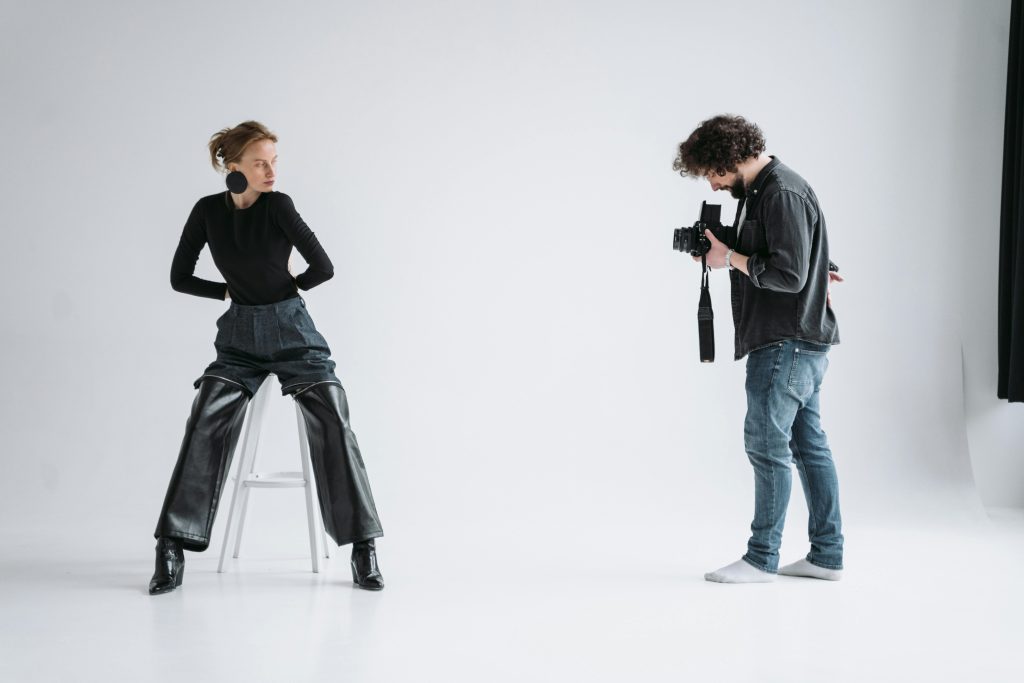
I think this compression fundamentally changes how we shop for fashion. Desktop users can scrutinize details that mobile users simply cannot access, even with pinch-to-zoom functionality. The mobile experience forces us to make purchasing decisions based on overall silhouette and color impression rather than craftsmanship details. This works fine for basic items like solid-colored t-shirts, but becomes problematic when shopping for structured pieces like tailored jackets or intricate evening wear.
Color Temperature and Mobile Screens
Here’s something most people don’t realize: mobile screens typically run warmer (more yellow/red tones) than desktop monitors, especially when automatic brightness adjustment kicks in. That navy blazer you’re considering might appear more purple-tinged on your phone than it actually is. Meanwhile, desktop monitors—particularly those used by photographers and designers—are usually calibrated to show more accurate colors.
This color discrepancy particularly affects neutral tones and subtle color variations. A beige trench coat might look distinctly different between your morning coffee desktop browsing and your evening commute phone scrolling. The problem compounds when you factor in different lighting conditions—your phone screen in bright sunlight versus your desktop in controlled indoor lighting creates two completely different viewing experiences of the same garment.
The Fabric Texture Dilemma
Fabric texture photography suffers the most in mobile translation. Those close-up shots showing cashmere softness or linen’s natural wrinkles lose their impact when viewed on smaller screens. Desktop users can appreciate the visual storytelling of fabric photography—the way light catches silk differently than cotton, or how wool appears to have depth and weight.
Mobile users miss these textural cues entirely. Instead, they’re making fabric quality judgments based on price point and product descriptions rather than visual evidence. This creates a disconnect between expectation and reality that often doesn’t surface until the item arrives.
Navigation Patterns and Discovery
The browsing behavior itself changes dramatically between devices. Desktop fashion browsing tends to be more methodical—users open multiple tabs, compare items side by side, and spend time reading detailed product information. The larger screen real estate encourages exploration of related items and detailed specification comparison.
Mobile browsing, by contrast, becomes more impulsive and linear. The single-screen focus means users are less likely to compare multiple items simultaneously. They’re also more prone to quick decisions based on the primary product image alone, since scrolling through multiple photos requires more deliberate effort on a smaller interface.
I believe this behavioral shift has actually influenced how fashion retailers structure their mobile presentations. They’ve learned to front-load the most compelling visual information and simplify product descriptions, knowing that mobile users have less patience for detailed exploration.
The Zoom Factor Problem
While mobile devices offer pinch-to-zoom functionality, the experience rarely matches desktop browsing quality. Zooming on mobile often results in pixelated images that don’t reveal additional detail—they just make the existing image larger and less clear. Desktop users can often access high-resolution images that maintain clarity at higher magnifications.
This limitation particularly affects accessories and jewelry shopping. Ring details, watch face clarity, and handbag hardware quality are much easier to assess on desktop. Mobile users are essentially shopping these categories blind, relying heavily on return policies and brand reputation rather than visual verification.
The Lighting Context Issue
Desktop browsing typically happens in controlled lighting environments—office spaces or home setups with consistent illumination. Mobile browsing happens everywhere: in bright sunlight, under fluorescent store lighting, in dimly lit restaurants, or in bed with only screen glow. Each of these environments affects color perception and detail visibility differently.
Outdoor mobile browsing in bright sunlight often washes out subtle color differences and makes it impossible to judge true color accuracy. Conversely, late-night mobile browsing can make colors appear more saturated than they actually are. Desktop users generally have more consistent viewing conditions, leading to more reliable color and detail assessment.
Who Benefits From Each Experience
Desktop browsing clearly benefits shoppers who prioritize quality assessment and detailed comparison shopping. If you’re investing in higher-end pieces, buying items with complex patterns, or shopping for special occasions where exact color matching matters, desktop browsing provides crucial visual information that mobile simply cannot match.
Mobile browsing works best for shoppers who already know what they want, are comfortable with brand sizing and quality, or are shopping basic wardrobe staples where precise detail assessment is less critical. It’s also ideal for quick trend checking and price comparison when you’re already familiar with the items.
The reality is that most fashion shoppers now use both devices in their decision-making process—mobile for initial discovery and quick browsing, desktop for final detailed assessment before purchasing. Understanding these visual limitations helps set appropriate expectations for each browsing session.
The visual gap between mobile and desktop fashion browsing isn’t going away anytime soon. Screen technology continues improving, but the fundamental physics of viewing detailed photography on small screens remains challenging. Successful fashion shopping increasingly requires understanding these limitations and choosing the right device for the right stage of your shopping journey.
For those serious about fashion quality and fit, taking time to review potential purchases on a larger screen can prevent disappointment and reduce return rates.
As an Amazon Associate I earn from qualifying purchases.